The Brief
Way Finding Collaboration
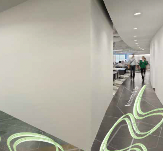
This project has been designed to teach us the skills it takes to collaborate with others and the importance of all inclusive way finding tools. During this process I have collaborated with another graphic Design student Josh Postance-Eamer and an Interior Architecture design student, Tommy Sheffield. Tom had already designed the buildings chematistics and decided its main Personal Users. Our users were a mixture of creative and logical thinkers, combing the financial and artistic sides of Bournemouth’s economy. The building is open to all users including the disabled members. Our job was to create eye catching tools which worked together to make a direct and helpful way finding system throughout the building, Amalgamate.
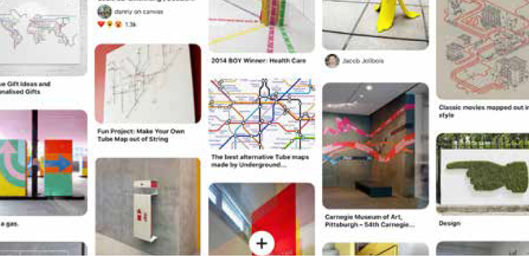

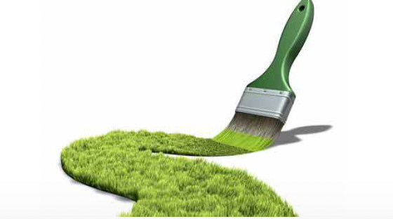
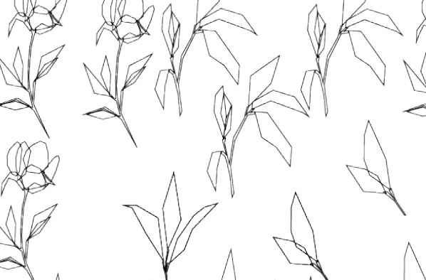
For this project I started by formularising self with what way finding systems where and how I was going to tackle this assignment on headfirst. I started by viewing other designers work on successful visual way finding systems. I did this mostly through Pinterest and google. I contributed to an empathy workshop which showed how the visually impaired members of our community saw the signage and systems in place around university. Doing this workshop has shown that when lights or bright colours have been used on the signage it makes it more accessible for the visually impaired. The signs around campus where also very tall which I believe must be quite struggling for wheelchair users or small members due to disabilities. Due to this I want to exercise the usages of height levels and also the use of bright colours combined with overhead lighting on main signage in the buildings way finding system. I wanted to look in to working with sustainable materials. The buildings main designs are based on organic structures which I want to push forward in to the materials which the way finding’s designed with or on to. I’ve looked in to a paint base which is eco friendly and orgainically sourced. The range of eco-friendly paints is growing, one which I want to use is Lime wash paint Made from slaked lime (generated from limestone), it is cured for almost a year to thicken, with a small amount of linseed oil added to help with wall application. The use of stainless steel throughout the building reflects the recycled nature of the building. I want to use steel and incorporate it somehow in to my designs if possible
Designing Stage 1


Designing Stage 2


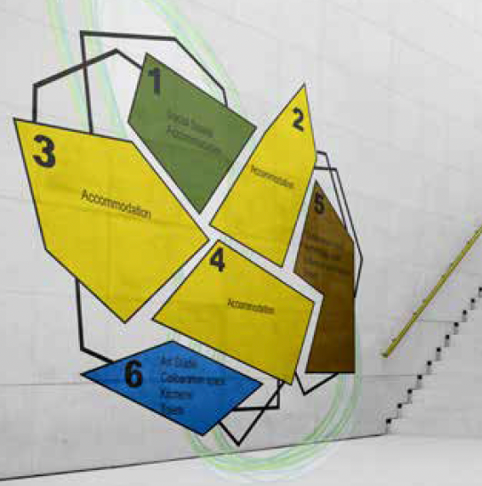
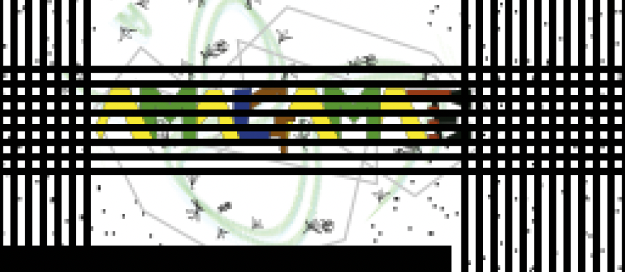
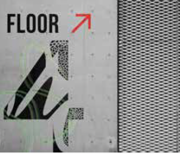
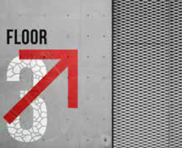
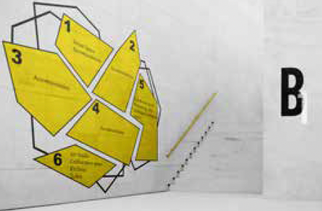
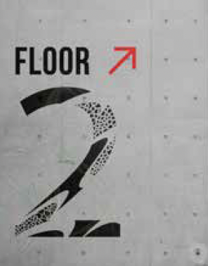
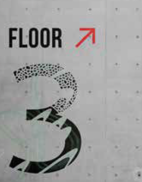
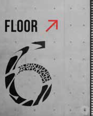
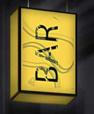
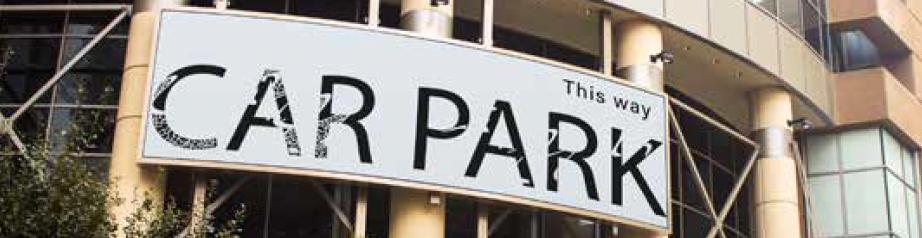
Final Signage Design


Critical Evaluation
Josh and I presented our work on 2nd December 2020, we presented how we got from point A to point B over this whole project. We received critical feedback which we have built on and developed to a great point which I have presented in this presentation deck. I wanted to look into the sustainable factors of this project but somehow during the development stages I forgot to include it in mine and joshes signage. If I was to take it further, I would research more materials which I could use and create exciting visuals for the users in the building. I enjoyed the visuals of the combination of the organic and geometric shapes, Josh and myself designed. I’m proud that we were able to include Braille under most signs for the blind and visually impaired users making the building an all rounded community. To push our visual way finding system to another level of design I would look more into the digital side of the building. Due to the users being digital nomads it might make the co spaces more adventurous and exciting to them as the users. We were told that the floor designs where too bright and everywhere to be a useful system. We want the system to be helpful and useful but not an annoyance to the residents of the building, with this we played around with the floor designs so they can be used by first time user and then blend into the background for the long-time users how would get there bearing of the building.